Showing posts with label Color Advice and Info. Show all posts

Tuesday, January 19, 2016

Y Design Loop : Richmond Road Living Room Re-design

Working with a Blank Slate : Richmond Road Living Room


Just completed in time for Christmas - the redesign of a living/ dining room in a west end Ottawa, condominium high-rise. The chairs were re-upholstered with Robert Allen Tapir fabric, the wallpaper is Crown Gold grass cloth, the fireplace is an electric Amanti, the tallboy was purchased by the clients and hand painted by 4 Walls, and the lighting is from Found Design Ottawa [quartz base lamps], Juno and Restoration Hardware .... who doesn't love a great before and after?


AFTER


BEFORE


Notice what a different new modern fabric makes to the clients' classic wing-back chairs.  The extra pieces were used for pillows.

Apple Red Bench
 

Warm up your home with a piece of red furniture ...


This is another example of what new upholstery fabric can do to an existing piece of furniture!  Here is a close-up of this really interesting fabric from one of my favorite companies, Maharam.  

It looks like a cross between snake skin and high school football jersey mesh...what a fabulous and unique combo.


And functionally, it's very durable for high use spaces such as this front foyer.

Stay cozy !


Tuesday, March 18, 2014

March's Top 3 Interior Design Tips : Easy Ways to Welcome Spring Into Your Home

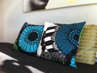
1] Buy some Marimekko pillows.


I recently discovered that EQ3 in Canada is selling products from this famous Finnish design company. How exciting and rejuvenating !

2] Paint something with a bright, unexpected color.


If you don't have the nerve, or the right furnishings to paint a whole wall, consider using bright colors on a smaller scale :

- inside a medicine cabinet
- wall above your kitchen cupboards
- window frame
- powder room ceiling
- closet shelves

3] Create a new focal point or vignette with your prize possessions.


- choose a wall with good sight lines, and uncluttered with electrical outlets, switches, architectural details, etc.

- center a piece of your furniture on the wall [can be a table, chair, credenza or a combination depending on the floor space you have]. It should be about 2/3 - 3/4 of the wall width.

- hang your artwork above, leaving some space around it to breathe and making sure it's large enough to fill the space without feeling crowded

- accessorize your furniture with your complementary collectables such as a lamp, sculpture, vases, bowls, etc. They may encroach on the space in front of your art, but not by too much.

- paint or wallpaper the wall to match

Enjoy and have some fun!

Blogatchalater!
Y


Wednesday, July 25, 2012

Brown : A Love - Hate Relationship

Yes we know - designers are known for their black clothing and for their love of all things white....and we see sooooooo much brown in Ottawa, we are constantly saying "Too Much Brown".  Really, does this city have color-phobia? Is it our pioneer roots? Our love of the outdoors? The color of our pets?

Actually, we do love brown and all it's shades and tints ... in moderation of course!!

One of our favorite paint colors is C2 Barnacle.  Here we painted a custom-designed floating vanity with this lovely soft brown color :


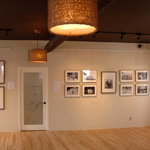
Another favorite paint color is Sherwin Williams Urbane Bronze - another brown!  Here we used it for the Exposure Gallery ceiling : 

And of course, there are the natural brown tones inherent in wood and porcelain tile in this Glebe foyer we designed :


But how much is too much? Well, of course this is subjective, but we believe no more than roughly 50% of visible surfaces should be brown. We also recommend using contrasting browns & materials - in other words, if the floors are going to be brown wood, then the walls, doors and cabinets should NOT be wood, unless the wood tones are contrasting such as bleached oak with dark stained walnut.

Some examples of  TOO MUCH BROWN / WOOD :


Thankfully, there is an area rug and large sectional to cover up the hardwood floor...otherwise this would have looked like a wood insane asylum. CKY IDEA : lighten things up by painting directly over the wood paneled walls with a light to medium tone to match the sofa undertones. The walls will still have the wood texture but not compete with the floor and everything else in the room.  And lower those framed prints down to eye level.

Wow, a lot of money was spent on cabinets for this kitchen. Notice how the undertone of the cabinets sides is yellow-orange and the undertone of the flooring is pinkish. Yikes ! CKY IDEA : instead of wood flooring we would have suggested a porcelain tile.  As a retrofit idea, we suggest to paint out the upper cabinet sides something light neutral with the same undertone as the floor such as Pratt & Lambert China White and paint the lowers the same color as the drawer fronts.

Elegantly appointed with good proportions and scale. But please, this room is screaming out for some color!!  CKY IDEA :  upholster the chairs in a lovely light aqua linen blend, and change the draperies with a similar aqua, brown or cream pattern to tie everything together, such as this one: Villa Vizcaya
Last, paint out all the trims and brown wall to a lighter neutral color, in order to create more spaciousness.


It's so dark and gloomy even with a large window! CKY IDEA : place a large modern area rug with a black or plum pattern on a cream background.

Final notes :  We are not being snobs ! There is a human perceptual phenomenon known as the Ganzfeld effect.  The effect is described as "the loss of vision as the brain cuts off the unchanging signal from the eyes. The result is "seeing black"- apparent blindness" [Wikipedia].  Basically, your vision tires from lack of contrast and thus your brain's neural noise amplifies as it seeks out missing visual signals or differentiations.  All this brown may cause a kind of blindness and hallucinations ! Yikes.

Blogatchalater.

Monday, June 25, 2012

Top 5 Interior Design Faux Pas : Part 1


1. Too much brown. And in this case, too much matchy-matchy naugahyde :


2. Too much furniture....looks like the sofa could actually catch on fire !


3. Sofa at the end of a bed - are you really going to sit here ? Having your back to the bed is just bad Feng shui


4.  Furniture lined up along wall. It looks a little like a flea market don't you think?


5. Too much wood.


ok, this one has many other problems such as clutter, mismatching styles, collectables stuffed up to the ceiling...stay tuned for Part 2 in July !!

Blogatchalater,
YP

Tuesday, March 20, 2012

March's Top 3 Tips - Scale is Everything

What does scale mean and how is it relevant to your interior space ?
Scale has several meanings, but the one we are demonstrating here means size, especially in relation to surrounding objects and architecture :

Tip #1 : Increase the scale of an object to achieve drama and/or strong focal point for a room. 
Here is an over-the-top example, but you get the idea ! :


Tip #2 : Think Big to make a statement. 
Notice that not only the size but location of this chandelier is not something usually seen; but because of the similar scale [and color] to the surrounding furnishings it absolutely works ! Living room by our design guru Phillipe Starck :


Tip #3 :  Think small, but many.
But be careful because with small tiles on a large area, it is easy for a space [especially a small shower stall such as this one] to look waaaay too busy.  This designer chose one, simple, smooth, dark color mosaic tile with contrasting grout. It's the lines that create the texture and pattern, not the tiles themselves :


Blogatchalater ! 

Tuesday, November 15, 2011

November's Top 3 Interior Design Tips : How to Mix Styles [aka Eclectic]

With such a vast number of interior design products available to you, it is easy to just go out and buy one of everything you love right!!!?  Will it all work together? Can you effectively mix styles and keep your sanctuary in tact ? The answer is yes it and here's how :

1] Select unifying/ complimentary characteristics [e.g. colour, texture, pattern, etc...] : In this case, shape (curves) and colour (warm neutrals with turquoise details) :

 Here we see shape (circles), materials (glass and metal) and tone working together to unify this grouping

2] Keep "mismatched" items in different areas of the room and on a neutral background. 

3] Give each piece breathing room [edit, edit, edit].


Every great object truly deserves it's own special place.....

Blogatchalater....

Wednesday, October 19, 2011

October's Top 3 Tips : How to Retrofit your Pre-Loved Condominium

So someone has already selected your flooring, cabinets, tiles, etc. What can you do to make your new condo yours without expensive renovations?

1] Window coverings : 
We list window coverings as the number one item to attend to because they can take from 4  to 12 weeks...that can be a long time living with bed sheets on the windows! 

Take stock of your views and the amount of sun coming in during the day. For large condo windows a popular look is modern, sunscreen, roll down blinds which provide some sunlight control and do not take away from the window architecture or views. If you require sun filtering for south-facing units, then add lined drapes.

For a more contemporary look, Roman blinds are an elegant way to add warmth and privacy to any room.
Condo boards often impose restrictions on what you can hang on your windows, in order to maintain a uniform look for the building. You can get around this by using double sided coverings with the condo-approved material facing out.

2] Paint :
Paint can be an inexpensive way of freshening up and adding drama at the same time to a pre-loved condo.

You will want to look at the amount of natural light in each room and determine the direction it is coming from...eg Northern is cooler southern is warmer.
This will affect your choice of colour.
Then determine how the space will be used and your furniture lay out before painting an accent wall (usually the wall you see first as you enter a room.)  Get inspiration from a carpet or accent pillow.  You will also want to take into consideration the amount of contrast the colour on the wall will have against the sofa or pictures being placed on it and make sure the wall colour works with your flooring.

Have fun with childrens' rooms and laundry rooms by using blackboard paint. By the way, it comes in colours other than black.


Buy test pots to determine how the colour will look in your room...paint on a board no smaller than 12" x 18" or purchase large sample sheets and place them around the room.
Remember, painting a dark room a light colour will not make the room light.
If you want a specific look, don't be afraid to call a designer for a colour consultation...this can save you a lot of time and money.

3] Review and edit your furniture : 
You say you already own a sofa and dining table, but do they really fit the new space? We all know you can't fit a round peg in a square hole ...here is a real life application.  Additionally, the sofa and dining table are usually the 2 largest pieces of furniture and need to be carefully considered. They are also the anchor or benchmark for all your other furnishings. 
Make sure you have ample room to move around them including space behind the dining chairs to comfortably get up from. The rule of thumb is 48" if the space behind the chairs is also a passageway. Generally, passageways should be a minimum of 30".
You may not like the idea of selling your existing furniture and buying new, but when you are moving it may be necessary in order to create your soothing, harmonious, not-too-crowded [or conversely not-too-empty] sanctuary.

Blogatchalater mates !


Saturday, January 22, 2011

10 Top Drawings to Communicate Design Concepts

aka a picture is worth 1,000 words

Did you see the Mike Myers skit he did on Saturday Night Live ? - SIMON - "you know my name is Simon, and I love to do some drawerings".....

OK, enough with the silliness. Seriously, at cky design group, we love to draw. It is our number one way to communicate our ideas with you, our clients, whether the drawings are computer generated or hand drawn. Consider these types of drawings we do for various interior design projects :

1] SKETCH - a loose, simple drawing used to communicate ideas quickly; aka napkin drawing


2] IMAGE BOARD - a design collage of the "look and feel" of the project; helps narrow down the myriad of choices to be made; can be made by us [cky] or you or both of us...we love to collaborate.


2] FLOOR PLAN - the essential drawing for all interior design projects; the main tool used to plan the space and determine the layout based on use/function of the space; the beginnings of the construction drawings


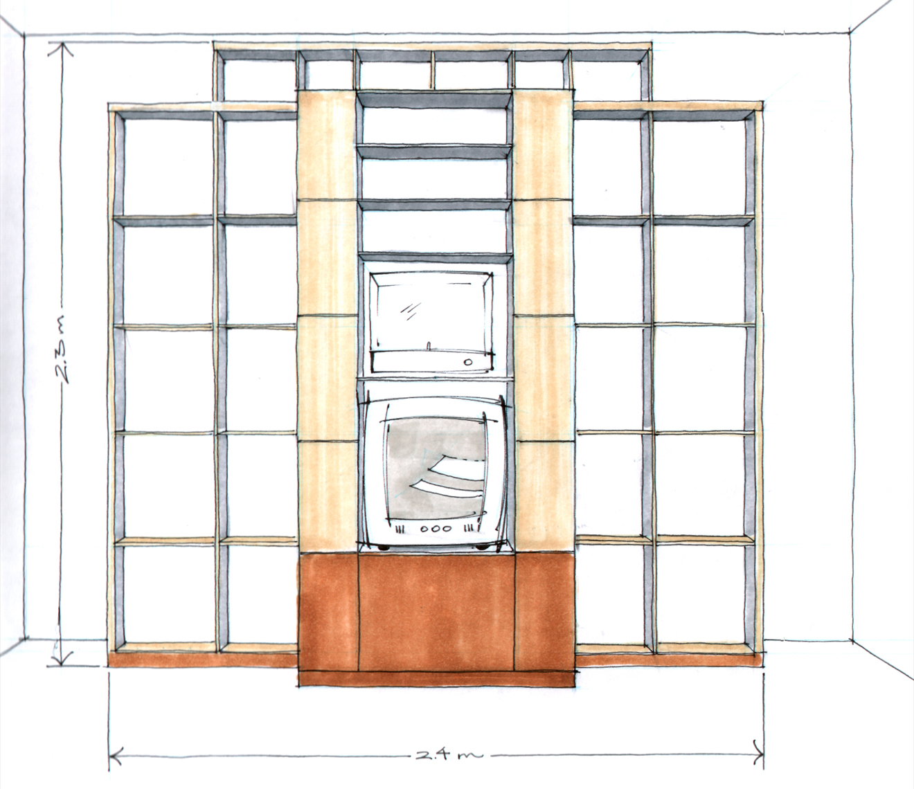
3] ELEVATION - also referred to as " Front, Top, North, South, East, or West View"; this drawing shows a wall [OR side of a product like a sofa or building] drawn to scale with all its existing features [e.g. switches, ceiling height, doors and windows, etc.]. It can be a WORKING DRAWING or a RENDERING [see below].


4] WORKING DRAWING or CONSTRUCTION DRAWINGS - this is what we give our contractors, in order to obtain a quote. Once the contract is signed, these drawings along with product specifications form part of the contract


5] SHOP DRAWING - usually this is a drawing produced by a fabricator for us [cky], to confirm how the cabinet, mirror, furniture or other custom item will be made

6] RENDERINGS - realistic images of what your project will look like, from different vantage points and using different drawing techniques. These drawings are quite technical and can be difficult/time consuming to produce accurately. There are companies who specialize in producing them and charge $100's to $1,000's. Here is a synopsis of the different type of renderings :

a] 1 POINT PERSPECTIVE - HAND DRAWING


b] 2 POINT PERSPECTIVE - WIRE-FRAME


c] 2 POINT PERSPECTIVE - COMPUTER DRAWN

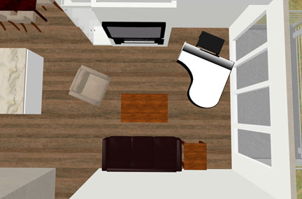
d] BIRD'S EYE PERSPECTIVE - COMPUTER DRAWN


e] AXONOMETRIC PROJECTION - one of the sexiest drawings and a great way to illustrate space planning and form. Click to see the Wikipedia entry


f] ELEVATION & 2 POINT PERSPECTIVE COMBINATION


Thank you for your interest and we hope this helps clarify some of our designer mumbo jumbo.

Blogatchalater!
cky

Thursday, September 30, 2010

3 Key Interior Design Tips

#1 Function supersedes form. 
Are you a homebody who likes relaxing & watching tv or are you a social butterfly, preferring to entertain friends & family?  Style, furnishings and material choices come after your space planning is defined. Your home should reflect your lifestyle and be designed for maximum use by you!


#2 Don't be afraid of colour! 
Colour is a inexpensive way to bring energy and excitement to any room, transforming the mood instantly.
-If you don’t want to paint an entire room in a dramatic colour create a focal point in your room with an accent wall.
-When choosing a colour just be mindful of picking up a colour that already exists in the room in a piece of furniture, a fabric or artwork. 


#3 Layer your lighting
Each room in your home should have 2 or idealing 3 layers of light.
1. Overall/Ambient: General illumination that comes from all directions in a room
2. Task: Lighting focused on a specific area to make the completion of visual tasks easier.
3. Accent: Lighting that emphasizes an area of or an object in a room. This lighting adds to the drama or style of a room by highlighting certain aspects of a room's decor. 

Subscribe to ckyscaper. More great home design tips to come!


Monday, September 27, 2010

Habitat For Humanity Designer Gift Home now open to the public!


Habitat for Humanity received the biggest donation in their history; a nice home in a great neighbourhood. It has been renovated from top to bottom using a dream team of talented and generous Ottawa designers, corporate sponsors, professional trades people and volunteers. The sale of this professionally designed home, will help provide 10 low-income, working families in the Ottawa region with a home of their own. 

We had great fun this summer working along side many other top Ottawa designers to help realize the finished Habitat For Humanity Gift Home. We had the honour of contributing towards the colour, art, staging and furniture of the below rooms. We sourced much of the furniture through Mikaza Home and Alteriors. I sourced the original artwork through Gallery 3 and Exposure Gallery.  Thanks guys for your generosity and support!

The designer kitchen by Design First Interiors


The beautiful living room by Linda Nolan Interiors

The unique study with wood panelled walls and leather floors! by Gordon Weima


The custom master bedroom and en-suite by Chuck Mills Residential Design and Development


The Gift Home will be open to the public for viewing for three consecutive weekends beginning on Sept. 24th at 12pm. Tickets are only $10.00 and are available at the door as well as at both Habitat NCR Restores.

This is such a great opportunity to get design ideas for your home renovations and give back to your community at the same time.

Here is the link to the gift home website and  how to get tickets.

http://habitatgifthome.com/news.html

Cheers, Carrie