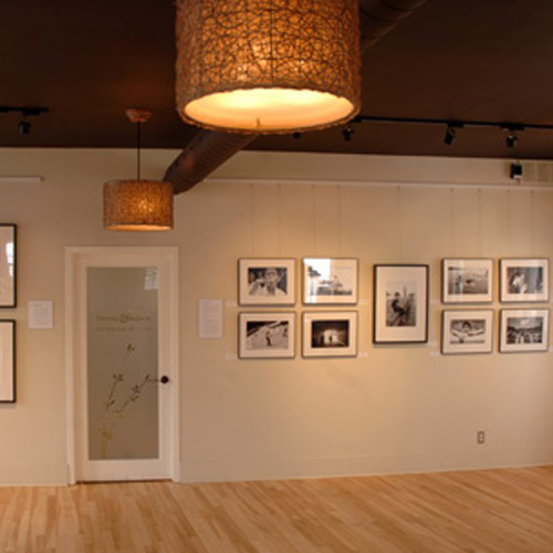
Yes we know - designers are known for their black clothing and for their love of all things white....and we see sooooooo much brown in Ottawa, we are constantly saying "Too Much Brown". Really, does this city have color-phobia? Is it our pioneer roots? Our love of the outdoors? The color of our pets?
Actually, we do love brown and all it's shades and tints ... in moderation of course!!
One of our favorite paint colors is C2 Barnacle. Here we painted a custom-designed floating vanity with this lovely soft brown color :
Another favorite paint color is Sherwin Williams Urbane Bronze - another brown! Here we used it for the Exposure Gallery ceiling :
And of course, there are the natural brown tones inherent in wood and porcelain tile in this Glebe foyer we designed :
But how much is too much? Well, of course this is subjective, but we believe no more than roughly 50% of visible surfaces should be brown. We also recommend using contrasting browns & materials - in other words, if the floors are going to be brown wood, then the walls, doors and cabinets should NOT be wood, unless the wood tones are contrasting such as bleached oak with dark stained walnut.
Some examples of TOO MUCH BROWN / WOOD :
Thankfully, there is an area rug and large sectional to cover up the hardwood floor...otherwise this would have looked like a wood insane asylum. CKY IDEA : lighten things up by painting directly over the wood paneled walls with a light to medium tone to match the sofa undertones. The walls will still have the wood texture but not compete with the floor and everything else in the room. And lower those framed prints down to eye level.
Wow, a lot of money was spent on cabinets for this kitchen. Notice how the undertone of the cabinets sides is yellow-orange and the undertone of the flooring is pinkish. Yikes ! CKY IDEA : instead of wood flooring we would have suggested a porcelain tile. As a retrofit idea, we suggest to paint out the upper cabinet sides something light neutral with the same undertone as the floor such as Pratt & Lambert China White and paint the lowers the same color as the drawer fronts.
Elegantly appointed with good proportions and scale. But please, this room is screaming out for some color!! CKY IDEA : upholster the chairs in a lovely light aqua linen blend, and change the draperies with a similar aqua, brown or cream pattern to tie everything together, such as this one: Villa Vizcaya
Last, paint out all the trims and brown wall to a lighter neutral color, in order to create more spaciousness.
It's so dark and gloomy even with a large window! CKY IDEA : place a large modern area rug with a black or plum pattern on a cream background.
Final notes : We are not being snobs ! There is a human perceptual phenomenon known as the Ganzfeld effect. The effect is described as "the loss of vision as the brain cuts off the unchanging signal from the eyes. The result is "seeing black"- apparent blindness" [Wikipedia]. Basically, your vision tires from lack of contrast and thus your brain's neural noise amplifies as it seeks out missing visual signals or differentiations. All this brown may cause a kind of blindness and hallucinations ! Yikes.
Blogatchalater.


If you're looking for an excellent contextual ad network, I suggest you take a peek at Propeller Ads.
ReplyDelete