Monday, August 29, 2011

Dilemma of a Modern Home Owner : How to Live Large in a Small Condo

With the desire to reduce urban sprawl, commuting and offer affordable housing to urbanites, several Ottawa developers have built several downtown condos with many more on the way,  including Central by Urban Capital - but how do you create your new modern sanctuary for more than just sleeping??  We advise choosing versatile furniture that has multiple uses for multiple activities :


1] The Calypso sofa bed - a throughly modern, sexy sofa which also opens up into a comfortable bed.

2] The Faze end table, shown here in oak wenge and brushed stainless steel frame, can be tucked into a sofa or bed and can be opened up to be a tv table.

3] The Cabo console table's clear thick glass practically disappears, and it also doubles as a sleek, modern desk.  


4] We just matched the modern classic Veuve chair with the above glass Cabo console / desk for a client. It looks and feels superb as a dining, side, desk or guest chair!  It's totally comfortable and doesn't take up as much space as an armchair or the Aeron chair.

5] We love this beautifully designed modern glass dining table called Enigma. It has a wood extension to accommodate guests or extra prep and serving room.  The black glass reflects the surroundings hence almost disappears while making a statement.


6] The sculptural Y Design Daybed can be used in a variety of ways such as a chaise between dining and living spaces or a guest bed as the name implies. (designed by cky's multi-talented Yvonne). Also serves as a gift wrapping or laundry folding surface !!

For more modern, condo style furniture options check out cky design group's new furniture pricelist

Blogatchalater xo

Thursday, August 18, 2011

August 3 Monthy Interior Design Tips : The Perfect Kitchen

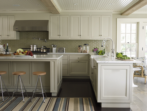
3 Tips for designing the perfect contemporary kitchen :

1] Cabinet Height

Build your upper kitchen cabinets up to the ceiling [or bulkhead as the case may be] :

If you don't, you will likely get a deep dark shadow,  more visual "clutter" not to mention an area for dust to collect as seen here :

2]  Layered Lighting

Make sure you have layered lighting in your kitchen for both tasks and ambiance

For proper implementation of a kitchen lightning design, there are four kinds of lights that you can use.
These are the task, accent, ambient and decorative lighting.
The task lighting focuses on making the kitchen a working one. This is the most appropriate lightning that lets you see your sharp knife as you prepare food. Task lighting is usually situated between the work surface and the person running the kitchen.
The accent lighting, as its name denotes, accentuates the whole kitchen. It adds dimension and depth to the whole space. Accent lighting is usually low voltage. An example of accent lighting are the fixtures placed underside cabinets to spotlight back splash and counter top materials.
The third kind of kitchen lighting design is the ambient lighting. This kind of kitchen lighting can immediately improve your kitchen look. Make sure your have enough recessed lighting to create a soft yet warm glow that soften shadows.
The last type of kitchen lighting design is the decorative lighting (pendants above an island for instance). Decorative lighting adds sparkle to your kitchen but make sure not to overdo it. It can make your space look overdone and cluttered.

3] Consider Your Finishes


Remember that high gloss finishes on cabinets and counter tops will show every finger print for heavy traffic kitchens. If you are a childless couple who love to clean, go for this modern and sexy look!


If you have children and spend a lot of time in your kitchen consider a honed granite or quartz counter top finish and satin finished cabinets, rather than high gloss, for less maintenance.

Blogatchlater!

Friday, August 5, 2011

Top 10 Movie Interiors

More Fabulous Sources of Design Inspiration


Down with Love, 1993
- a really fluffy girl movie with wonderfully re-created 1960's interiors throughout the film; we love the black, yellow, pink and white color palettes!


The Dark Knight, 2008
- New York's dark side - multiple amazing interiors especially the Mayor's gala event that the Joker crashes


The Big Lebowski, 1998
- one of my favorite actors John Turturro and architects Richard Neutra


Diamonds are Forever, 1958
- another Neutra interior


Auntie Mame, 1958
- an amazingly styled authentic 1950's film; again, we love the all white interior!


 Scarface, 1983
- Tony Montana's bathtub - almost makes us want to be a drug dealers!


Quantum of Solace, 2008
- partly designed by Italian architect/ designer Antonio Citterio, who Y met during her design internship in Milan, 1996.


What Women Want, 2000
- Mel sucks but his apartment in the movie is awesome !


Lost in Translation, 2003
- So Japanese - so Zen - what's not to love ?


I Am Love, 2009
- So Italian !!! Love the richness and classic details [not to mention Tilde's clothing]


The Cook the Thief  His Wife & Her Lover, 1989
 - another fabulous Jean Paul Gaultier project

ok so who's counting?

Other movies with fabulous interiors not included, but should be :

- American Psycho
- Babel
- Austin Powers [both films]
- Something's Gotta Give
- Single White Female
- Ghost
- Year of the Locust
- Sex in the City [first one]

Blogatchalater !